
Whether you are presenting information orally or in writing, charts and graphs are a valuable tool. Humans are attracted to visual stimulation, so adding a few illustrations helps capture and retain your audience’s attention. They can also add clarity because we process images much faster than textual information.
There is a point of diminishing returns, however, especially in a data-dense presentation or report. After the first few, bar charts and pie charts can become boring. Even with careful use of color, they begin to look alike, and things may start to run together in the minds of the audience.
Another challenge: bar charts and pie charts are essentially one-dimensional. When the story to be told is multi-dimensional or dynamic, then it becomes necessary to assemble a series of charts which can quickly become unwieldy as well as tedious and confusing.
The solution? Expand your visual toolbox. Bubble charts, pictograms, radar and flow charts, heat maps, and tree maps can help you tell a more compelling story using fewer visuals.
1) Bubble Chart
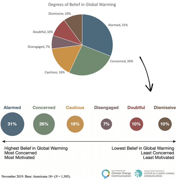
Let’s say your survey measured attitudes about global warming among a target population. The tried-and-true way to visualize the numbers is with a pie chart. It depicts the relative prevalence of each degree of belief. Something important is missing, however. The attitudes represented by the pie sections lie on a continuous spectrum. That is important to the overall story being presented and it is not readily apparent based on the chart.
Below is the same data visualized using a bubble chart instead of a pie chart. As with the pie chart, we see the relative prevalence of each degree of belief. We can also instantly see where each lies on a spectrum of concern and motivation. The bubble chart presents more complete information in a more powerful way.
2) Pictogram
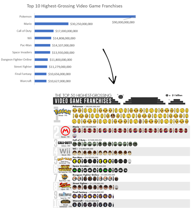
A chart can be more powerful simply because it is more interesting visually. The top ten highest-grossing video game franchises are easily represented by a conventional bar chart or by a pictogram. Which is more likely to keep your audience focused?
3) Radar Chart
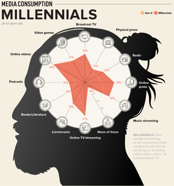
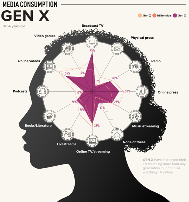
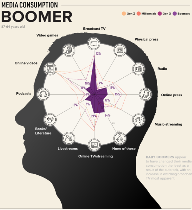
A recent study examined how media consumption has changed among generational cohorts in the age of Covid-19. The data can be presented conventionally in a series of vertical bar charts.
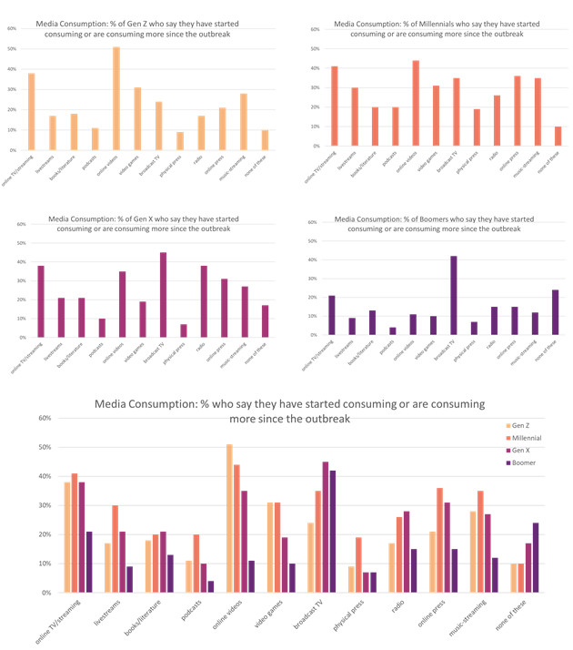
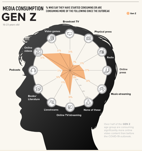
Another approach is to use radar charts with graphic backgrounds that help differentiate the charts and link each with the cohort it represents. Note how each chart incorporates data from the preceding ones, making it easy to compare cohorts visually.
4) Flow Visualization
Complex and dynamic data sets present still more challenges. Suppose you need to report a complete picture of estimated energy consumption in the U.S. in 2019. The data set includes the relative amounts generated by source; the relative amounts allocated to electricity generation versus directly to various consumption sectors, and the relative amounts consumed by services and rejected by consumption sectors. Let’s take a look at how that data might be presented using pie charts and bar charts. (Note: the unit of measurement is a quad. One quad = a quadrillion BTUs.)
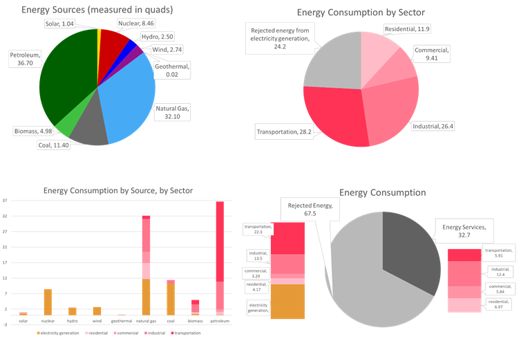
There is a lot of information to take in and while each chart is clear and concise, it isn’t easy to grasp the overall picture. Now, compare this series with the flow visualization below which contains the exact same data.
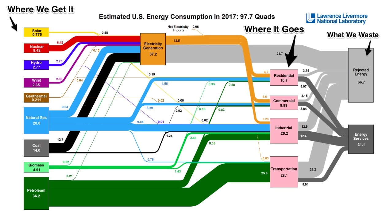
With this presentation, the full complexity of the system is immediately evident, and the audience can more easily see how all the “moving pieces” fit together. It is easy to shift focus from one set of data points to another, e.g. from sources of energy to consumption by sector, while maintaining perspective on the overall picture.
5) Heat Map
Another way to depict multi-dimensional data in a compact way is with a heat map. A consumer study asked how often respondents purchase natural or organic products in specific categories, and analysis included comparisons among demographic segments. A clear trend was evident across income groups. The bar chart makes the point, but the heat map does it more clearly and concisely
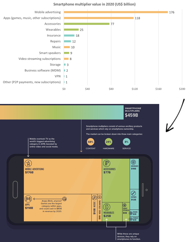
6) Tree Map
Sometimes the data to be depicted is relatively simple while the story it tells is multi-dimensional. The bar chart below depicts the values of products and services that comprise the smartphone multiplier market. The next visual, a tree map, conveys the same data but also groups the products and services into three relevant categories in a way that makes it easy and intuitive to compare relative values both within and across the categories.
These are just a few examples of how incorporating a bit of variety in your visuals can make your reports more interesting and effective. As with anything, however, always be sure you are using the right tool for the right job. Choose the chart type that will best serve your data and the story you are telling.