
Mobile devices are now the norm and not the exception across the US. The latest Pew Research study states that 96% of the US population own mobile phones, 81% own Smartphones, and over 50% own tablet devices. The number of mobile respondents actually exceeds that of desktop and laptop respondents for certain online surveys. Given this, online surveys really must be designed with mobile users in mind to obtain the most valid and representative results.
Mobile surveys do not necessarily have to be “short surveys”, with only a handful of questions, and limited graphics and images. However, mobile surveys should be as concise and user friendly as possible to avoid respondent fatigue and burn out.
Below are some tips for designing mobile-friendly survey questions.
.png) User-Friendly Design: Make the survey as easy as possible to answer on a mobile device by using the following:
User-Friendly Design: Make the survey as easy as possible to answer on a mobile device by using the following:
-
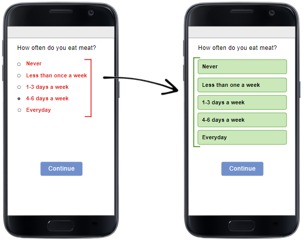
- Larger, easy to select buttons for answers to the survey questions to accommodate respondents using their fingers (including thumbs) to answer the survey
- For multiple questions on the same page, implement auto-scrolling to the next question once the current question is answered
- For questions on separate pages, allow respondents to auto continue to the next question without having to hit “continue” at the bottom of the page

Limit Need for Scrolling:
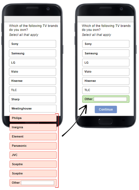
To avoid overwhelming the respondent on a small screen, try to keep all question text concise and brief to eliminate the need for scrolling horizontally right to left and back and forth. Although vertical scrolling is not as tedious for respondents, a way to keep this scrolling to a minimum is to limit the number of answer options for every question. Try only including options that are most likely to be selected and eliminating ones that will most likely not be chosen. Consider adding an “other” option to capture those options which will rarely be selected, and any additional choices respondents may want to include.

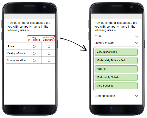
Use Matrix Questions Wisely:
Traditional matrix survey questions are displayed in a grid format with a horizontal Likert scale. This type of grid typically does not display well on mobile screens. Matrix questions are best displayed as individual drop-downs that reveal the answer options for each choice, or as vertical buttons. If you would like to keep the mobile survey question layout consistent with the layout of your desktop/laptop survey, you will need to design your matrix questions accordingly.
 Limit Number of Scale Points:
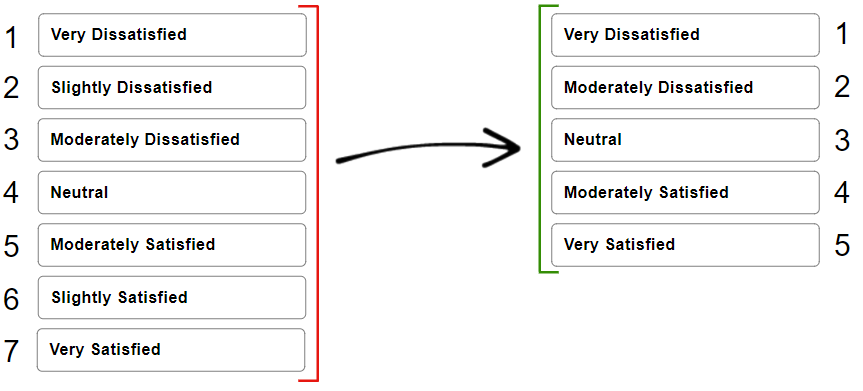
When using Likert scales on the matrix questions discussed above, consider limiting scales to 5 points instead of 7 or 10 points to avoid the need for scrolling on smaller mobile device screens.
 Optimizing Images and Graphics for Mobile:
Lastly, although certain mobile respondents may be using WIFI to answer your survey, others may not have a strong enough connection to download larger images and graphics. In order to optimize images and graphics for mobile devices, their sizes should be reduced, optimized, or compressed. Using jpeg images will also help reduce the lag time of downloading images to mobile devices.
Using the tips mentioned above will help you with both your response rates and the quality of your mobile survey responses in the future.